

Strategy & Transformation
How to Calculate ROI for AI and Software Modernization
A practical, finance-ready framework for comparing AI and modernization investment with the current-state cost, realistic benefits, delivery risk and time to value.
operationalwrocław--:-- cet
∕ insights / reporting-and-dashboards.md
Reporting And Dashboards
Practical guide to reporting and dashboards that drive real decisions, covering types, architecture, MVP delivery, and governance for SaaS teams.
>_article.meta
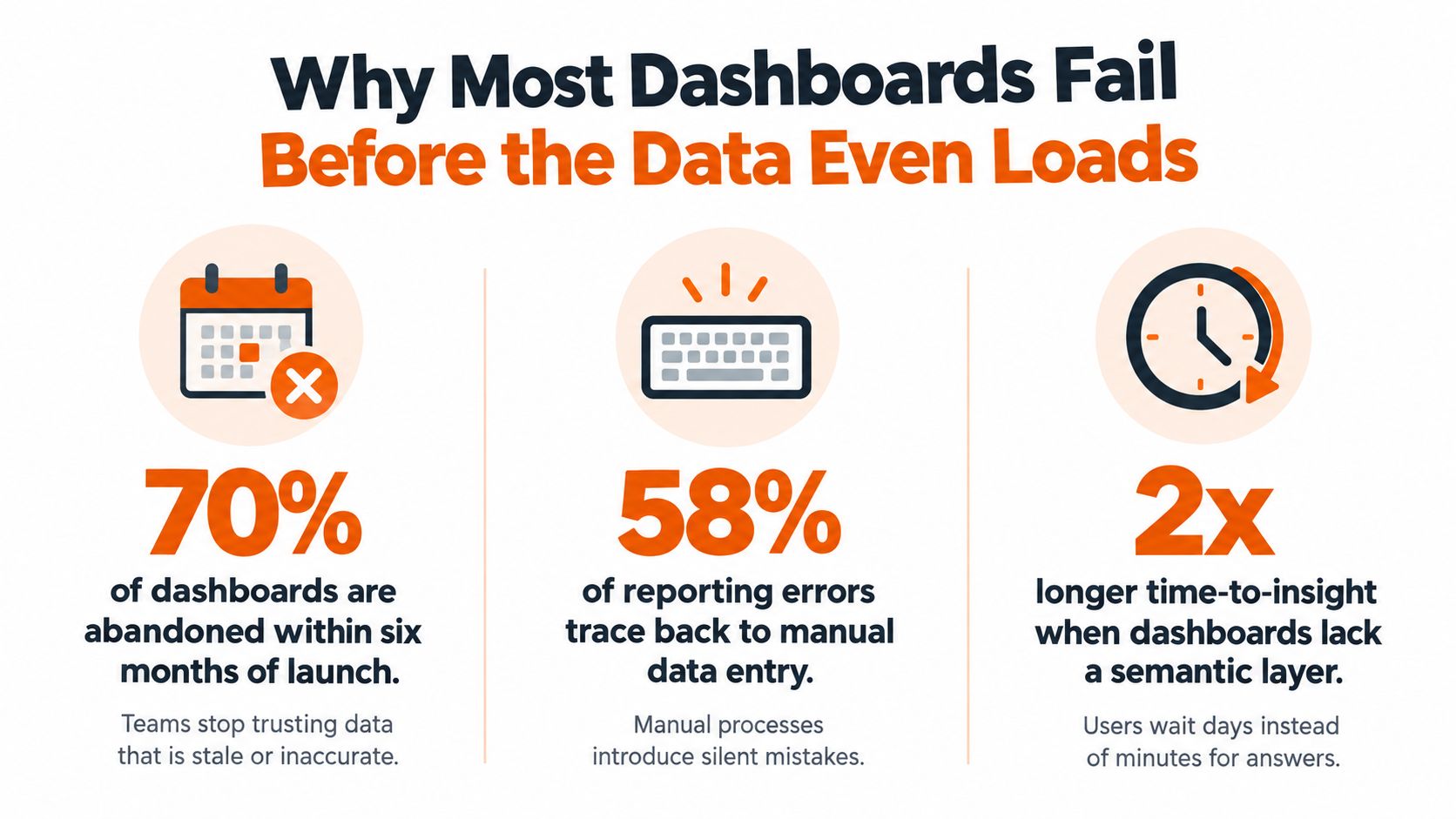
Most dashboard projects fail for a simple reason. Teams ask for prettier charts when they need a defensible decision system. If the numbers can't survive a board meeting, an incident review, or a finance check, the dashboard is decoration, not reporting and dashboards.
The fix is not more widgets. It's clear metric contracts, governed pipelines, explicit decision thresholds, and senior accountability. That's the standard that keeps a dashboard useful after launch, when conflicting tiles, late data, and ownership gaps start to surface.
If you want a quick gut-check before you commission another dashboard, view your dashboard and ask one question, does every tile tell you who acts next?
The fastest dashboards are often the first ones to fail in production. Not because the charts are ugly, but because the team skipped the hard part, lineage, uncertainty, and ownership. A beautiful KPI wall doesn't help when two tiles contradict each other and nobody can explain why.
That's the board-meeting problem most SaaS leaders eventually hit. Finance says one ARR number, product says another, and the CEO is left asking which system to trust. In that moment, chart style is irrelevant. The issue is whether the dashboard was built on governed reporting or on hope.
Teams treat a dashboard like a presentation layer. They rush to connect data, add visuals, and ship. That works until the first question about timing, definition, or source system. Then everyone starts arguing about the number instead of acting on it.
A better standard is to treat every tile as a contract. If a metric can't say what it measures, where it came from, who owns it, and when it refreshes, it's not ready for executive use. That's why reporting and dashboards should be designed for defensibility first, speed second.
Practical rule: if a metric can't be traced back in a few clicks, it doesn't belong in front of leadership.
The same logic applies to teams evaluating existing views. If you're auditing a messy dashboard set, start by asking which numbers can support a decision and which ones only look busy. That's the difference between a working operating system and a screen full of noise.
Reporting answers what happened. Dashboards answer what's happening and what should we do about it. That distinction matters because each one needs a different level of freshness, context, and governance.
The idea didn't come from modern BI tools. Hans Peter Luhn is widely credited with using the term business intelligence in 1958, where he described using facts and relationships to guide action toward business objectives (modern BI history and dashboard evolution). In the 1960s, decision-support systems became more practical as organizations adopted computerized data storage. In the 1970s and 1980s, data warehouses and OLAP tools made it possible to consolidate information and analyze it at different levels of detail. By the 1990s, executive information systems pushed management reporting closer to on-demand access, and web technologies in the early 2000s made BI easier for nontechnical users.
That history isn't trivia. It explains why modern dashboards still depend on consistent definitions, reliable source systems, data integration, security, and controlled metric logic. A dashboard is just the visual evolution of governed reporting. It is not a replacement for it.
The practical implication is blunt. If your warehouse is messy, your dashboard will be messy faster. If your definitions drift across teams, your charts will expose the drift instead of fixing it. Good reporting and dashboards make truth visible, but they don't create truth from weak inputs.
For teams aligning KPIs and business outcomes, this internal guide on OKRs and KPIs is worth keeping close. It helps separate outcome metrics from vanity metrics before anyone starts designing tiles.
Good dashboards don't invent clarity. They preserve it.
Operational, analytical, and executive dashboards do different jobs. When teams blur them together, they create slow tools that satisfy nobody. Separate them, and the trade-offs become obvious.
| Dashboard type | Best use | What it needs most |
|---|---|---|
| Operational | Live monitoring of onboarding, checkout, fraud, support queues | Low latency, narrow scope, alerting |
| Analytical | Product, growth, and data exploration | Drill-down, segmentation, flexibility |
| Executive | Board reviews, weekly business cadence, leadership oversight | Context, lineage, concise decision signals |
Operational dashboards are for people who need to act now. If onboarding breaks, if payments stall, if a fraud queue spikes, this is the view that should tell the team where to look. Keep the scope tight and the refresh cadence appropriate to the process being watched.
Don't overload this type with historical analysis. If a live dashboard becomes a reporting graveyard, the operators will stop using it.
Analytical dashboards are for inquiry. Product managers, growth leads, and data teams use them to explore patterns, compare segments, and test hypotheses. These dashboards can be slower, because the point is depth, not immediacy.
Executive dashboards are not about showing everything. They compress business health into a few tiles that can survive challenge from finance, product, or the board. Here context matters more than clutter. If a tile can't explain where the number came from, it shouldn't be there.
A SaaS company usually evolves through these three layers as the business grows. Start with one operational view, add analytical depth when the team needs answers beyond monitoring, then build executive reporting once leadership needs a shared operating picture.
A dashboard earns trust from the architecture behind it. If the data path is sloppy, the result is faster-looking unreliable reporting. Credibility work starts at the source systems.
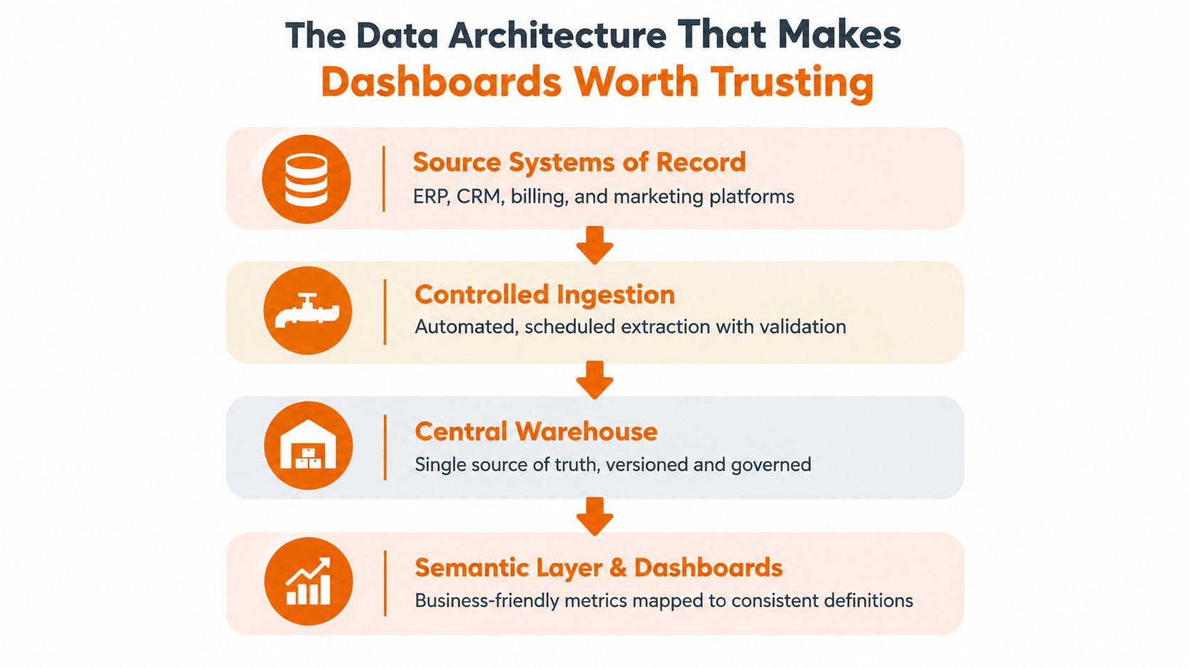
Use four layers: systems of record, controlled ingestion, a semantic or governed metric layer, and a consumption layer that respects access rules and refresh expectations. Without those layers, the same metric will mean different things in different teams.
Governance usually breaks in predictable ways. Late-arriving data shifts a trend after the meeting. Undocumented transformations hide business logic. Access expands until people see numbers they should not. Conflicting definitions make the same tile disagree with finance, sales, or operations.
For teams modernizing the data layer before they rebuild the interface, database modernisation before application rebuild is a practical place to start.
Every serious dashboard should rest on a metric contract. Write down the definition, source, owner, refresh cadence, target, and decision threshold. If the contract is missing, the dashboard is a guess with charts.
Opinionated truth: a metric that isn't owned is already broken.
Specialized data work matters here too. If you need a trusted pricing or coverage view, the discovery process matters more than a polished front end. Teams looking to find wine pricing data get better results by validating source quality first, then designing the dashboard around what the data can support.
A dashboard MVP should solve one business problem cleanly. Anything more is scope creep dressed up as ambition. For qualifying projects, the fastest route is a fixed scope, fixed price delivery with one senior accountable owner driving the whole result.
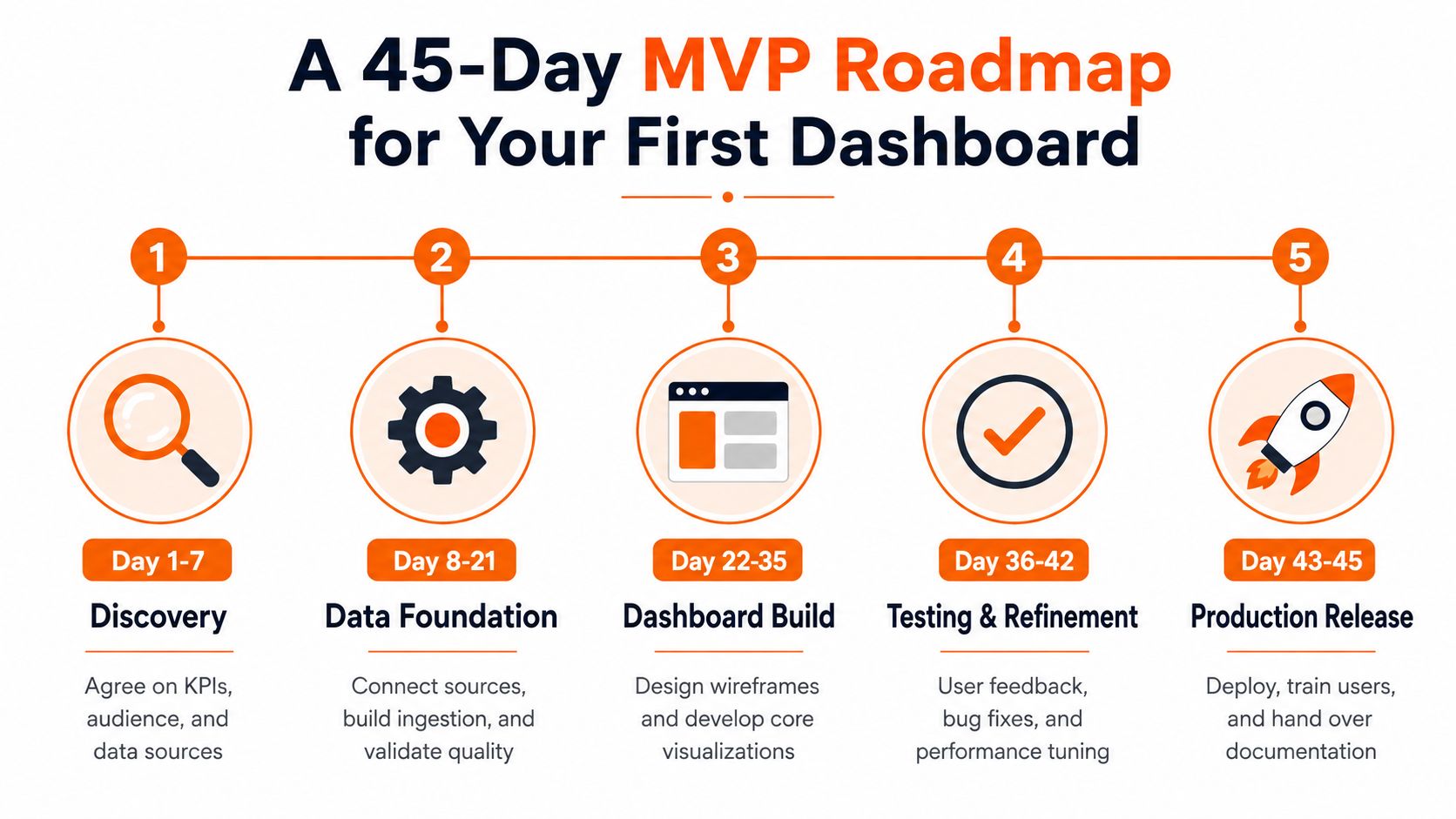
Start with the business question, not the tool. Agree on the audience, the KPI list, the source systems, and the action each metric should trigger. If the team can't say who will act on the dashboard, it isn't ready to build.
That first week should end with a signed metric contract and a clear owner. No code yet. Just clarity.
Connect the source systems, create the ingestion path, and validate the quality rules. This stage is where hidden issues show up: missing fields, mismatched timestamps, inconsistent definitions. Fix those now or you'll ship arguments later.
Wireframe the layout, map the semantic layer, and build only the core views. Keep the screen focused on the business decision, not every metric the team can access. If a tile doesn't help answer the main question, cut it.
Validate usability, check performance, and confirm the handover docs. Train the people who will use it, and make sure support ownership is explicit. See how Visbanking builds bank dashboards for a useful example of how focused dashboard design keeps the experience tied to real operational needs.
For a practical build sequence, this internal guide on how to build an MVP is a solid companion.
A dashboard is a product. If it's hard to read, slow to load, or easy to misinterpret, users will work around it. They won't forgive it because the pipeline is “technically correct.”
A 2025 electronic-dashboard study rated overall usability at 0.82 on a 0 to 4 concern scale, where 0 meant no concern and 4 meant catastrophic concern. The same study gave spatial organization and information coding the best possible score of 0 (dashboard usability study). That's the right signal. Layout and labeling are not cosmetic, they're core engineering quality.
Track the dashboard like you'd track any other product surface.
Every tile should serve one decision. Every label should match the metric contract. Every color choice should support interpretation, not decoration. If a chart needs a long explanation, the design is already doing too much work.
Performance matters just as much. Query budgets, caching, and pre-aggregated views are not backend trivia. They decide whether the dashboard feels operational or bloated. Executives won't wait for a dashboard that loads like a data science notebook.
If the screen is slow, people stop believing it's current.
Scaling reporting and dashboards means turning one-off views into a governed product surface. That shift is visible in the delivery metrics teams already use. DORA defines deployment frequency, change lead time, change failure rate, and failed-deployment recovery time as core measures of delivery performance (DORA metrics guide). Use the same discipline for dashboards that you use for software releases.
That means treating a dashboard change like a production change, because it is one. If the metric definition moves, if permissions change, or if the data contract breaks, the business can make the wrong call.
AI changes the economics of the work, not the standard of the work. Senior architects and engineers still own architecture, data, security, testing, and production quality. AI can accelerate analysis, code generation, documentation, testing, and migration, but it can't take accountability.
NIST is clear on the guardrails. Establish a test plan and response policy before building highly capable systems, use a purpose-built testing environment, and document when humans override AI decisions (NIST AI guidance). That's the right model for AI-native reporting too. Let agents do more work, but keep the controls tight.
Governance is what makes self-service sustainable. It prevents stale metrics, unauthorized changes, and unclear ownership. It also makes onboarding easier, because every team can reuse the same definitions instead of inventing their own.
A partner like Rite NRG fits that model when a SaaS team needs senior delivery capacity, governed reporting design, and AI-assisted implementation without losing engineering accountability. That's not magic, it's just a disciplined delivery system with the right people on it.
Before you build anything else, check these boxes. The business problem is framed as a decision. Metric contracts are written. Source systems and owners are named. The MVP is scoped to 45 days. Governance, observability, and handover are planned. AI acceleration is layered on top of senior review, not used as a shortcut.
If one of those is missing, stop and fix it. That's how you avoid shipping a dashboard that looks finished but can't stand up under pressure.
The best next step is a 30-minute scoping call with the people who own the data and the decision. Bring the KPI list, the system map, and the question the dashboard must answer. A good partner will pressure-test the roadmap, challenge the scope, and tell you what should be cut before anyone writes code.
Rite NRG helps teams plan and build reporting and dashboards with senior engineering accountability, governed data design, and AI-native delivery. If you need a dashboard that can survive real business pressure, visit Rite NRG and start with a scoping conversation built around your actual data stack, decision flow, and delivery timeline.
/ about the author
Written by the RITE NRG editorial team — the architects, engineers and delivery leads who build and operate AI-era software for our clients.
Strategy & Transformation
A practical, finance-ready framework for comparing AI and modernization investment with the current-state cost, realistic benefits, delivery risk and time to value.
Technology Talent & Teams
A decision-maker's guide to IT partnership models: what each model actually transfers to the partner, what it costs beyond the rate card, and how to match the model to your situation.
AI Consulting & Automation
A practical framework for choosing and deploying transport or logistics AI agents around real exceptions, reliable data and controlled operational authority.
More guidance: all insights articles
Tell us about the system or idea behind this article. We tell you honestly if it is a fit — and what a fixed-scope delivery could look like.