Most advice about software productivity measurement starts in the wrong place. It tells you to count commits, pull requests, story points, or lines of code, then calls the result a dashboard. That approach measures visible activity while ignoring whether customers received something valuable, revenue moved, or the product became easier to operate.
A productive software team isn't the team that produces the most artefacts. It's the team that converts time, judgement, tooling, and attention into reliable customer value. That means faster learning, shorter paths from idea to production, fewer defects, stronger retention, and less rework. It also means measuring the system rather than turning individual developers into numbers.
The UK's national approach offers a useful starting point. The Office for National Statistics definition of labour productivity is output per unit of labour input, usually measured as output per hour, output per worker, or output per job. Software leaders should borrow that logic, then define output as business value rather than keyboard activity.
Why Most Engineering Productivity Metrics Mislead
More commits don't prove higher productivity. Neither do more pull requests or completed story points. These measures are attractive because GitHub, GitLab, Jira, and similar tools make them easy to collect, but ease of collection isn't the same as decision value.
A developer can split one change into several pull requests, close a set of small tickets, and produce a busy-looking activity trail without improving the product. A team can complete a sprint full of estimated work while delaying a difficult architectural decision, leaving customers with an awkward workflow and the business with a growing maintenance burden.
Activity creates the wrong incentives
Once leadership treats an activity measure as a target, engineers adapt their behaviour to the target. Estimates become inflated because a larger story appears to represent more output. Large pieces of work get divided into smaller units because completion counts look better. Developers avoid refactoring because the work may improve reliability without increasing the number of visible features.
That isn't a character flaw. It's a predictable response to a poorly designed measurement system.
Practical rule: If a metric can improve while customer value stays flat or quality declines, it doesn't belong near an individual performance review.
SaaS organisations see this most clearly when a team ships a feature that nobody adopts. The delivery board turns green, release notes look full, and engineering reports strong throughput. Product analytics later show that the feature didn't solve a meaningful customer problem. The organisation has measured completion, not impact.
Vanity metrics hide system costs
Activity measures also conceal the cost of getting work through the system. A high commit count tells you nothing about review queues, unclear requirements, dependency delays, interrupted focus, or incident-driven rework. It can't show whether a feature reached production in time for a commercial opportunity or whether customers received a stable experience.
The House of Commons Library explanation of productivity connects productivity with output produced for a given input, and links that relationship to living standards. The same principle applies inside a SaaS company. Engineering input has a cost, whether it appears as salaries, contractor fees, platform spend, or scarce leadership attention. Output must therefore mean something the business and its customers can recognise.
Start with questions that activity dashboards avoid:
- Did customers adopt the capability?
- Did the change reduce friction or support demand?
- Did revenue, retention, or time-to-value improve?
- Did the team reduce future rework and operational risk?
- Did the organisation learn quickly enough to change direction?
If the dashboard can't support those conversations, it isn't measuring productivity. It's displaying motion.
Defining Productivity Measurement for Software Delivery
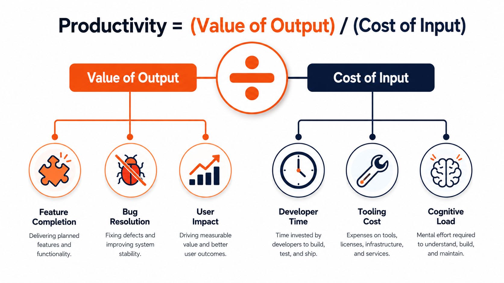
Productivity measurement is the ratio of valuable output to the cost of input. In software delivery, valuable output means customer outcomes, dependable product capabilities, lower operational friction, and learning that improves commercial decisions. Input includes developer time, tooling, coordination, cognitive load, and the opportunity cost of choosing one initiative over another.
The ONS defines labour productivity as output per unit of labour input and uses output per hour to account for different working patterns. Its ONS productivity methodology shows why a ratio provides more useful context than a raw count. For a SaaS company, the same discipline connects engineering effort with value created, rather than rewarding activity that merely looks busy.
Output isn't the same as outcome
Engineering teams still need output measures. Features shipped, defects resolved, deployments completed, and infrastructure changes provide useful evidence about delivery. They become misleading when leaders treat them as the definition of value.
Outcome measures test whether delivery mattered. Feature adoption shows whether customers use what the team built. Retention and expansion connect product value with commercial health. Time-to-value shows how quickly customers reach a meaningful result, while customer-reported defects reveal whether quality holds up in real usage.
Use a clear hierarchy:
- Activity: commits, tickets, meetings, and review counts.
- Delivery output: features deployed, incidents resolved, and changes released.
- Product outcome: adoption, task completion, customer satisfaction, and reduced friction.
- Business outcome: revenue, retention, margin, and strategic learning.
Keep the lower levels, but use them to diagnose the higher ones. A longer cycle time can explain delayed adoption. More defects can help explain weaker retention. A trusted dashboard connects these signals instead of rewarding a team for maximising one layer.
Nearshore delivery partners operationalise this model by agreeing on outcome measures with product and commercial leaders, then pairing them with delivery evidence. That makes reviews useful for decisions about scope, staffing, quality, and customer value, rather than contests over ticket volume.
Time is another input. Founders assessing onboarding or CTOs reviewing a new team can use this guide on how to measure time to productivity to distinguish joining an organisation from becoming effective within its delivery system.
Productivity measurement works when every squad can explain what value moved, what input it consumed, and what evidence supports the conclusion. That language keeps engineering output tied to revenue and customer value, not vanity metrics.
Comparing Popular Measurement Frameworks
No framework answers every productivity question. DORA is strongest when you need delivery-system signals. SPACE adds human and organisational context. Velocity helps teams plan near-term work, but it should stay a planning aid rather than become a scorecard.
What each framework reveals
DORA focuses on delivery performance, including deployment frequency, lead time for changes, change failure rate, and recovery performance. It helps identify whether a team can move changes through production quickly and safely. It doesn't, on its own, tell you whether customers value the changes or whether a release supports commercial priorities.
SPACE takes a broader view across satisfaction, performance, activity, communication and collaboration, and efficiency and flow. It suits organisations that can combine system data with developer experience signals and thoughtful qualitative review. Its breadth is useful, but it demands disciplined interpretation and reliable data collection.
Velocity and story points remain useful for planning within a team that understands its own estimation system. They lose credibility when leadership compares teams, links points to individual performance, or treats estimates as a proxy for customer value.
| Framework | Best For | Data Complexity | Business Alignment | Distributed Team Fit |
|---|---|---|---|---|
| DORA | Delivery speed and stability | Moderate | Partial, needs product measures | Strong when pipelines are instrumented |
| SPACE | Holistic team health and flow | High | Stronger, especially with outcome context | Strong, provided communication data is consistent |
| Velocity and story points | Local planning and forecasting | Low | Weak as a business measure | Limited for cross-team comparison |
Distributed teams benefit from explicit workflow data because managers can't rely on overheard conversations or office visibility. That doesn't mean remote workers should face surveillance. It means the organisation should make priorities, ownership, dependencies, decisions, and outcomes visible.
A work-management system can help connect initiatives, owners, dependencies, and delivery evidence. Teams operating in Australia, for example, may find this monday.com resource for Australian businesses useful when evaluating how to organise operational information. The platform isn't the measurement strategy. It can support one when leaders define the questions first.
Use DORA for flow and stability, SPACE for the conditions behind performance, and velocity only for local planning. Then add product analytics and commercial measures. The combination is more trustworthy than adopting one fashionable framework and expecting it to explain the whole business.
For teams formalising delivery capability, a DevOps maturity model can provide useful structure around automation, ownership, feedback, and operational practice. Treat maturity as a means to improve outcomes, not a badge to display.
Metrics That Actually Drive Business Outcomes
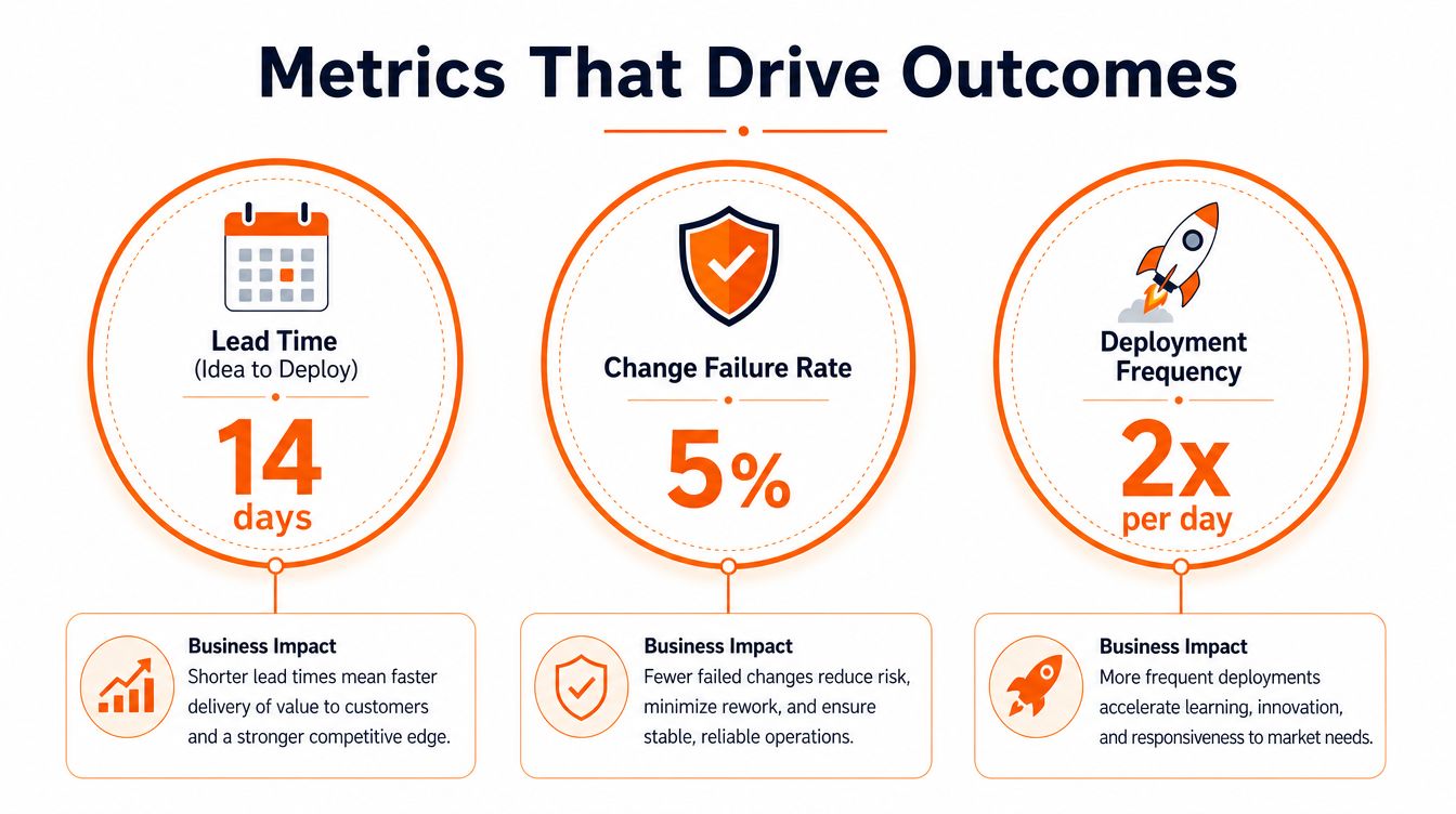
A useful dashboard should be small enough to review weekly and rich enough to expose trade-offs. I recommend combining delivery flow, quality, adoption, and commercial context rather than publishing a long catalogue of engineering activity.
The first measure is cycle time from idea to production. Pull timestamps from your product backlog, issue tracker, version control system, CI/CD pipeline, and deployment records. Define the start and end points consistently, then examine where work waits. This is more valuable than measuring coding time because delays often occur in prioritisation, review, testing, approval, or release coordination.
Feature adoption connects delivery to customer behaviour. Link release flags, product analytics, and customer segments so the team can see whether a capability is used by the audience it was designed for. A shipped feature with weak adoption should trigger discovery and positioning questions, not a celebration of output.
Customer-reported defect rate provides a quality signal that internal test suites can't fully replace. Connect support tickets, incident records, monitoring, and release versions. Review severity and customer impact, not just ticket volume. A small number of serious defects can consume more value than many minor reports.
Revenue per engineering hour can help founders test investment logic, but handle attribution carefully. Assign engineering effort to a product initiative, connect that initiative to a defensible commercial result, and label assumptions clearly. Don't pretend that every revenue movement came from one release.
Finally, pair deployment frequency with change failure rate. More releases can shorten learning cycles, but only if the product remains dependable. The ONS productivity measures overview reinforces the broader principle that productivity is outcome-based, tracked through output per hour, job, and worker rather than activity alone.
A weekly CTO dashboard might include:
- Flow: idea-to-production cycle time, with waiting stages visible.
- Value: adoption of recently released capabilities and time-to-value for key journeys.
- Quality: customer-reported defects, failed changes, and rework.
- Commercial context: initiative-level revenue or retention signals where attribution is credible.
- Capacity: engineering time spent on new value, reliability, support, and unavoidable maintenance.
The ONS flash estimate for Q1 2026 showed whole-economy output per hour worked 0.4% higher than Q1 2025, while output per worker was 0.1% lower over the same period. The ONS Q1 2026 productivity release demonstrates why managers should track both hours-based and worker-based views. The measures can diverge when employment, hours, and output change at different rates.
For practical implementation details, use this guide to software delivery metrics alongside your product and finance data. Metrics earn a place on the dashboard only when they change a decision.
Common Traps That Undermine Trustworthy Measurement
A scale-up once celebrates a rise in pull request merges. The engineering manager sees faster movement, but developers have started splitting ordinary changes into smaller reviews because merge count appears in the leadership report. The metric improved, while the workflow became more artificial.
That is Goodhart's Law in practice. When a measure becomes a target, people optimise the measure rather than the underlying result.
The traps appear familiar
Vanity metrics are easy numbers that make a team look active. Lines of code, commits, ticket counts, and story points can all rise while adoption remains weak or technical debt grows. Countermeasure: attach delivery data to product and quality evidence.
Local optimisation occurs when one team improves its own measure while making the broader system worse. A platform team might reduce its queue by pushing complexity onto product teams. Countermeasure: measure the end-to-end path from customer need to reliable production value.
Cross-team comparison punishes context. A team modernising a legacy service faces different dependencies and risk from a team building a new workflow. Countermeasure: compare each team with its own baseline, then investigate differences rather than ranking teams.
Individual scoring creates surveillance anxiety and damages collaboration. A developer who reviews difficult changes, mentors colleagues, or resolves architectural ambiguity may produce fewer visible artefacts while increasing the team's effectiveness. Countermeasure: keep productivity measurement at team and system level.
Performance-review coupling destroys candour. If a metric affects compensation, people have a rational reason to conceal friction or manipulate the inputs. Countermeasure: use measurement for improvement, capacity decisions, and system design. Use judgement, evidence, and leadership context for performance conversations.
The ONS has documented revisions and a processing-error correction in recent productivity releases, including flash estimates for 2025 and 2026. The ONS discussion of productivity revisions and composition is a useful reminder that even national measures require interpretation. Your software dashboard needs the same discipline. Record definitions, data quality, revisions, and known blind spots.
A trustworthy metric doesn't claim to be perfect. It makes its limits visible and still helps the team choose a better action.
Implementing a Measurement System Your Team Trusts
A dashboard earns trust only when it changes a decision. Engineers need to know what you measure, why it matters, how you interpret it, and what consequences the numbers will not trigger. If the system cannot guide a product, delivery, or investment choice, remove the metric.
Start with the decision, not the tool
List the decisions the measurement system should improve. Examples include removing an approval gate, funding test automation, changing product priorities, or adding capacity to a bottleneck. This keeps the team focused on business value rather than activity signals such as commit counts or lines of code.
Set a baseline before setting a target. A baseline exposes variation, missing data, and measurement flaws. It also prevents leaders from choosing targets that reflect ambition rather than delivery reality.
The ONS has used multiple productivity approaches over time. Its August 2026 measurement overview describes combining HMRC Real Time Information payroll data with self-employment and hours data from the Labour Force Survey. The lesson applies directly to software delivery: changing the input source can change the conclusion.
A Reuters report linked from the ONS methodology notes that the RTI-based measure showed UK output per worker up 4.2% since 2019, compared with 2.3% under the older survey-based method. The ONS productivity measures overview reinforces the underlying point: measurement depends on definitions, sources, and context. Treat engineering data with the same care.
Build the operating loop
Use a staged implementation:
- Agree the value model: Define the customer and business outcomes that matter, such as retention, revenue, activation, or reduced support demand.
- Select data sources: Connect GitHub or GitLab, Jira or Linear, CI/CD, observability, support, product analytics, and finance.
- Establish definitions: Specify timestamps, ownership boundaries, exclusions, and how revisions are handled.
- Create a shared view: Start with a spreadsheet or lightweight dashboard. Automate ingestion once manual work becomes a bottleneck.
- Review and adapt: Examine the evidence in retrospectives and leadership reviews, then change the system when it stops helping.
Bring engineers into the design before publishing the dashboard. They see hidden work, legacy constraints, review quality, and the difference between a useful small change and a risky large one. Ask them to challenge definitions, not just approve the colours.
Keep two feedback loops separate. Teams use operational metrics to improve their delivery system. Leaders use broader evidence to make investment and prioritisation decisions. Neither loop should become a leaderboard.
Review the model regularly. Document uncertainty, data gaps, and changes in definition. A precise-looking number is still incomplete if it cannot connect engineering output to customer value and commercial results.
Scaling Productivity Measurement with a Nearshore Delivery Partner
Nearshore delivery removes the convenience of proximity. You can't rely on who appears busy in an office or who speaks first in a meeting. A distributed team needs explicit ownership, visible decisions, reliable delivery data, and direct links between engineering work and product outcomes.
That is where a strategic partner earns its place. The partner should help define the measurement model, connect delivery signals to customer evidence, surface risks early, and create a cadence where teams act on the information. It shouldn't just provide a list of skills and wait for tickets.
Rite NRG operationalises this approach through the #riteway methodology, built around Extreme Ownership, high energy, and proactivity. In practical terms, that means a team takes responsibility for outcomes, raises delivery risks before they become surprises, and works with product and commercial stakeholders rather than treating requirements as a queue. AI-powered processes can support workflow automation and risk visibility, but accountability stays with people.
A transparent dashboard gives clients a shared view of cycle time, quality, dependencies, and progress. A Build-Operate-Transfer model can then transfer the operating practices, data definitions, and ownership routines to the client when an internal team takes over. The measurement system becomes part of the capability, not a report that disappears with the supplier.
Choosing a nearshore partner requires more than checking technical coverage. Use this guide on how to choose a nearshore partner to examine communication, ownership, delivery evidence, and the handover model before signing.
If your engineering dashboard still rewards activity instead of value, Rite NRG offers technology and delivery consulting, dedicated nearshore teams, platform development, and Build-Operate-Transfer support with outcome-oriented measurement built into the operating model. Visit Rite NRG to discuss your delivery bottlenecks, define the right metrics, and build a team that turns engineering input into measurable customer and business value.