Acquisition is up. Demo bookings look healthy. Pipeline reviews feel fine. Then the churn report lands, activation is weak, support keeps hearing the same complaints, and nobody can say with confidence where users are getting stuck.
That's not a marketing problem. It's not just a product problem either. It's a user experience optimization problem, which means it's a revenue, retention, and delivery problem at the same time.
Most SaaS teams still treat UX like surface polish. That's a mistake. In the UK, every £1 invested in UX returns an average of £100, which equals 9,900% ROI according to Lyssna's UX research summary. If we're serious about growth, we stop treating UX as decoration and start treating it like a strategic driver.
Stop Guessing Why Customers Leave
Monday starts with confidence. Signups look healthy, the roadmap is full, and the team is shipping. By Thursday, activation is flat, trial users are stalling, and churn is creeping up. Nobody agrees on why. Sales blames positioning. Product blames onboarding. Engineering blames legacy complexity. That's what guessing looks like in a SaaS business.
Users rarely file a clean report explaining where the experience broke. They hit friction, lose momentum, and leave. If we wait for complaints, we wait too long.
The fix is not another redesign debate. The fix is operational discipline. User experience optimization means managing the path from intent to value with the same rigor we apply to roadmap delivery. We trace where users hesitate, where handoffs fail, and where time-to-value slips. Then we fix those points fast, with product, design, and engineering working as one delivery system.
That changes how strong teams operate. They stop treating UX as a design layer and run it as a shipping discipline. Nearshore collaboration helps here because feedback loops stay tight, delivery stays continuous, and the team can test, refine, and release improvements without burning weeks in handoffs. Add AI-assisted research synthesis, pattern detection, and prototype iteration, and we get sharper decisions faster. That is how UX starts producing predictable business results instead of isolated design wins.
One rule matters more than the rest. If no one owns the user journey end to end, we keep shipping feature-level improvements while retention stays stuck.
That ownership starts before the first wireframe. If our view of the buyer, category, or use case is off, we optimise the wrong experience. Tools for B2B market research help sharpen positioning, expose faulty assumptions, and show which jobs customers are hiring the product to do.
We also need a higher bar for what gets built. Products grow when they feel useful fast, not when they look impressive in a review. Our guide to lovable product thinking shows how to prioritise that from the start.
Stop debating symptoms. Diagnose the journey, align the team around delivery, and ship fixes that change user behaviour.
Find Your North Star with Outcome-Driven Metrics
A UX programme without clear metrics turns into theatre. You get workshops, sticky notes, and polished components. You don't get better activation or stronger retention.
The right starting point is one question: what business result are we trying to move? If you can't answer that cleanly, your team will optimise visuals while the funnel leaks.
Start with task success, not opinion
For SaaS, the strongest UX metric is often task success rate. Can users complete the job they came to do?
That matters because navigation and flow design are not neutral. In UK SaaS platforms, navigation aligned to users' mental models reaches an 80% task success rate, compared with 9% for navigation based on internal company logic, according to HatchWorks' user experience statistics summary. That gap is massive. It means teams that organise products around org charts, internal terminology, or feature ownership are actively making the product harder to use.
Here's the blunt advice: stop naming things the way your team talks about them internally. Use the language your customers use when they're trying to get work done.
Measure what connects to money
You don't need a giant dashboard. You need a short list of metrics that tie directly to revenue, retention, and support load.
| UX Metric | What It Measures | Business Impact |
|---|---|---|
| Task success rate | Whether users complete a core action | Strong signal for conversion, activation, and retention |
| Time to value | How quickly users reach a meaningful outcome | Faster activation and lower early churn |
| Drop-off rate | Where users abandon a flow | Exposes revenue leaks in onboarding, checkout, and upgrade paths |
| Error rate | How often users hit preventable problems | Higher errors usually mean more support burden and lower trust |
| Return user rate | Whether users come back after initial use | Useful proxy for product value and habit formation |
| CSAT or NPS | How users rate their experience | Adds sentiment to behavioural data so you don't misread the numbers |
If you lead community or customer-facing operations as part of the product loop, this breakdown of essential metrics for community operations leaders is a useful companion because it keeps the focus on health signals that matter after onboarding too.
Build a lean research loop
You don't need months of discovery to get useful signal. You need discipline.
Use a tight cycle like this:
Identify one high-value journey
Pick one path that matters commercially. Signup, onboarding, first project creation, invite flow, trial upgrade, renewal settings.Map the user's intended outcome
Write the user goal in plain English. Not “engage with dashboard”. Try “connect data source and see first report”.Audit current behaviour
Use product analytics, heatmaps, support logs, and session replay to spot hesitation, loops, and abandonment.Run quick user sessions
Ask users to complete the task while thinking aloud. Don't guide them. Watch where the product creates uncertainty.Translate findings into metric targets
Example: improve task success, reduce time-on-task, cut avoidable form errors, increase repeat usage of a core feature.
The best metric is the one your whole team can influence and your finance lead can respect.
What good looks like
A strong north star metric does three jobs:
- It reflects user value, not internal activity
- It can be measured consistently
- It leads to action, not dashboard admiration
If your team argues for weeks over colour palettes while task completion is unclear, you're not doing optimization. You're decorating uncertainty.
Build and Validate at High Velocity
Once you know what outcome matters, speed becomes the differentiator. Not reckless speed. Validated speed.
Too many teams still move from insight to backlog to build with a long delay in the middle. That delay is where momentum dies and assumptions sneak back in. We need a faster loop: spot friction, prototype the smallest fix, test it, then build with confidence.
Prototype the smallest thing that can answer the question
Don't prototype the whole product. Prototype the risky moment.
If users keep failing during onboarding, build the exact onboarding slice. If trial users don't connect integrations, mock that flow. Use Figma for clickable prototypes, real content where possible, and realistic states for loading, errors, and confirmations.

The goal isn't visual perfection. The goal is behavioural truth. Can the user complete the task without confusion?
Mobile-first is not optional
Many SaaS teams still underperform here. They test on a laptop, approve the experience, then discover later that mobile usage is chaotic.
In the UK, 77% of e-commerce sites fail on basic mobile usability, including tappable elements that are too small or too close together, and 32% of users abandon a task because of that issue, according to Baymard's UX statistics. The lesson carries directly into SaaS flows that rely on forms, settings, approvals, and dashboard navigation.
Use these checks in every prototype review:
Touch targets first
Buttons, links, and controls must be easy to hit on real devices, not just visible in a design file.Form behaviour under pressure
Test keyboard layouts, field validation, error messaging, and submit states on mobile.Scrolling and hierarchy
Users should always know what the next action is. Don't bury the primary CTA under noise.Interruptions
Test what happens when the user gets distracted, loses connection, or returns later.
Build accessibility and performance into the first pass
Accessibility and performance aren't compliance chores. They are user experience.
A slow page, vague focus state, weak contrast, or inaccessible form field creates friction for everyone. Build prototypes and MVP tickets with accessibility acceptance criteria and performance checks attached from day one. If your team leaves those for later, later usually never comes.
Build fewer things. Test them earlier. Raise the bar on the moments that decide whether users continue or quit.
This is also why MVP discipline matters. A useful guide to agile MVP development reinforces the same principle: ship the smallest product slice that proves demand and usability, then scale what works.
What to avoid
A few common traps slow teams down fast:
Prototype inflation
Don't simulate edge cases you haven't validated as important.Design handoff theatre
Static screens with no states, no annotations, and no interaction logic create rework.Late testing
If users only see the flow after engineering has built it, you've paid too much to learn.
High-velocity UX teams don't just move quickly. They learn quickly.
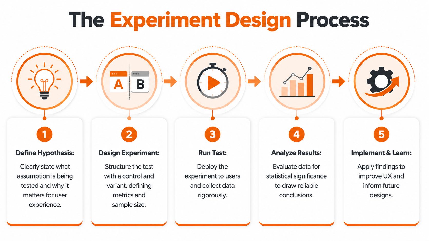
Design Experiments That Deliver Certainty
A/B testing gets talked about like a growth tactic. It's better than that. Done properly, it's a decision system.
Without experiments, product teams default to politics. The loudest voice wins. The most senior opinion carries more weight than user evidence. That's a weak operating model.
Use hypotheses, not hunches
Every experiment should start with a plain statement:
If we change X for Y users, we expect Z outcome because we observed specific friction.
That structure forces discipline. It ties the proposed change to a user segment, a measurable result, and a reason grounded in observed behaviour.
Before you launch any test, define:
Primary metric
The one result that decides whether the experiment workedSecondary metrics
Signals that reveal side effects, such as downstream completion or support contactGuardrails
Metrics that must not get worse, such as drop-off later in the flow or customer satisfaction
To visualise that operating rhythm, use this process as your team's default:
Test the places where certainty matters most
Not every screen deserves an experiment. Focus where user behaviour has commercial consequences.
Good candidates include:
Landing and signup pages
On these pages, acquisition either converts or leaks.Onboarding checkpoints
First value moments often decide whether a user returns.Upgrade and expansion flows
Pricing, packaging, and feature gate friction show up here quickly.Critical task flows
Account setup, integrations, approval paths, reporting, and exports.
The test itself can be simple. Control versus variant. One meaningful change. Clean measurement.
Lean usability testing still works
Formal experimentation isn't the only way to reduce risk. Quick usability testing remains one of the most impactful practices available.
The long-standing 5-user rule shows that testing with just five users uncovers around 85% of usability issues, according to We Are Tenet's UK UX statistics. That's why strong product teams don't wait for perfect sample sizes to learn. They run tight feedback loops early, then use broader experiments when traffic and scale justify it.
If your team needs a practical operational walkthrough, this SaaS usability testing guide for founders is a solid reference for structuring sessions without overcomplicating them.
A short explainer can also help align stakeholders who still think testing is slow:
Read results like an operator
The point of an experiment is not to declare victory quickly. It's to decide what to do next with confidence.
A clean loss is more valuable than a muddy win. It tells the team what not to scale.
When results come in, ask:
- Did the primary metric move in the right direction?
- Did secondary behaviour improve or degrade?
- Did the change work for the intended segment, or only for a subset?
- What did session replay or user notes explain about the result?
That last part matters. Numbers tell you whether something changed. User evidence tells you why.
Power Your Delivery with a Nearshore Partnership
A strong UX strategy still fails if delivery is fragmented. This is the gap most articles ignore. They talk about research, wireframes, and tests. Then they skip the hard part, which is getting product, design, and engineering to ship the intended experience predictably.
That's where nearshore collaboration becomes a strategic advantage, not just a staffing model.
Treat delivery as one team
If design hands work to engineering like a relay baton, quality drops. The product loses detail in translation, edge cases get improvised, and validated assumptions turn back into assumptions.
A better model is shared ownership. Product, UX, and engineering work as one unit with clear rituals:
Daily syncs for blockers
Keep decisions fresh and remove ambiguity before it spreads.Weekly demos with real flows
Don't demo tickets. Demo user journeys.Design reviews inside delivery
Check built behaviour, not just coded completion.Decision logs
Capture why the team changed a flow so nobody rewrites history later.

Nearshore teams excel when they are integrated correctly. Time zone overlap supports fast clarification. Cultural proximity helps keep product nuance intact. Senior engineers can challenge weak assumptions instead of passively implementing them.
Speed matters when learning matters
In UK SaaS, integrating nearshore teams such as those in Poland can accelerate UX testing cycles by up to 40%, according to the verified claim captured in Alida's referenced UX optimisation summary. That matters because shorter testing cycles mean faster learning, lower acquisition waste, and quicker MVP refinement.
This isn't about outsourcing UX. It's about increasing the speed and consistency of the feedback loop.
What good governance looks like
The strongest nearshore setups don't rely on heroics. They rely on operating rules.
Consider this model:
| Delivery layer | What to establish | Why it matters |
|---|---|---|
| Product ownership | One clear decision-maker for priorities and trade-offs | Prevents backlog drift and duplicated effort |
| Design system | Shared components, patterns, and acceptance criteria | Protects consistency across teams |
| Engineering alignment | Early involvement in prototypes and test findings | Reduces rework and feasibility surprises |
| Communication cadence | Structured syncs, demos, and async updates | Keeps momentum without meeting overload |
| Post-release feedback | Analytics, replay review, and support input | Turns shipping into learning, not closure |
Teams don't lose velocity because nearshore is hard. They lose velocity because responsibilities are vague and feedback arrives too late.
Don't buy capacity, build throughput
A lot of companies still approach partners as extra hands. That's a less effective mindset. Capacity without ownership creates more coordination cost. Throughput comes from a team that understands the user, the business objective, and the delivery standard.
That's why the best nearshore relationships feel less like vendor management and more like one disciplined product organisation working across locations.
Automate and Accelerate with AI-Powered UX
AI can speed up user experience optimization. It can also make it worse.
The common mistake is thinking AI replaces judgement. It doesn't. It compresses the time between signal and action when you use it properly.
Use AI where it removes analysis drag
Good uses are practical:
Research synthesis
Summarising interview notes, clustering themes, and drafting candidate hypothesesSession review support
Flagging repeated friction patterns across recordings so humans can inspect fasterSurvey and test preparation
Generating first-pass questions, segment ideas, or experiment variantsOperational triage
Spotting recurring UX issues from support conversations, product feedback, and behavioural logs
These workflows free up product managers, researchers, and designers to focus on interpretation and prioritisation. That's the right division of labour.
Don't automate trust away
There's a hard business reality now. With the UK AI Safety Act projected to come into force in 2026, 41% of enterprises are at risk of UX audit failures due to non-transparent AI personalisation, according to the verified claim in FullSession's UX optimisation summary. If your product personalises content, nudges, recommendations, or workflows without clear transparency, compliance risk becomes user experience risk.
That changes the brief. Explainability is no longer a nice extra. It's part of the product.
If users can't understand why the product is behaving differently, they won't trust the experience, even if the algorithm is technically effective.
The operating model that works
Use AI as an accelerator inside a human-led system:
- Let AI surface patterns
- Have product and design validate the signal
- Turn findings into explicit hypotheses
- Test changes with users
- Document how personalisation works and how users can understand or control it
Teams exploring this balance between product craft and AI-enabled velocity will find useful perspective in this take on Lovable AI product delivery, especially if they're trying to move fast without turning the experience into a black box.
The winners won't be the teams using the most AI. They'll be the teams using AI with the clearest rules.
Own Your User Experience Own Your Growth
User experience optimization isn't a redesign project you complete and archive. It's an operating rhythm. Measure the journey. Find the friction. Prototype fast. Test hard. Ship with ownership. Use nearshore collaboration and AI to increase learning speed, not chaos.
The companies that grow predictably don't separate UX from delivery or delivery from business results. They treat the full customer journey as one system and own it end to end. That's the standard. If we want stronger retention, better conversion, and less waste, we stop shipping features in isolation and start building experiences users desire to return to.
If you want a partner that treats UX, product strategy, and software delivery as one accountable growth engine, talk to Rite NRG. We help SaaS teams move faster, de-risk delivery, and build products users stick with because the experience works where it counts.